I've built quite a few computers, but always felt that I lacked an understanding of how the computer actually worked. I knew how to put together the high level components (motherboards, CPUs, graphics cards, etc.) to create a computer, but I didn't fully understand how those components worked.
In Electronic Instrumentation this fall I learned the basics of transistors, logic gates, and integrated circuits. So I understood the basic building blocks of computers, and the high level components. The next step is to figure out how to use the basic building blocks to create the high level components.
The goal of this project is build a working 8 bit computer on a breadboard using only basic integrated chips and other microelectronic components.


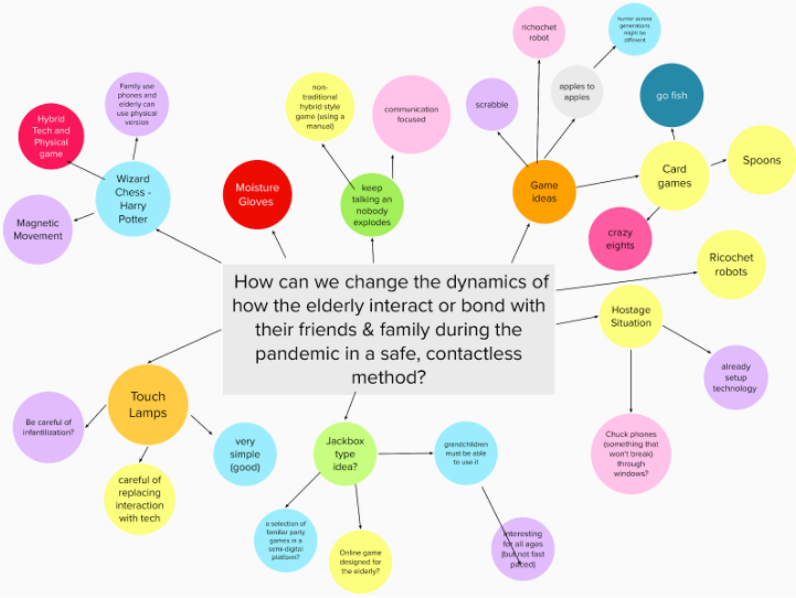
Our team's first step was brainstorming and user research. We started by using mind maps to brainstorm a variety of different concept ideas, while simultaneously doing user research. In this stage, we also benchmarked existing technologies to get a sense of the specifications of preexisting products.
.png)
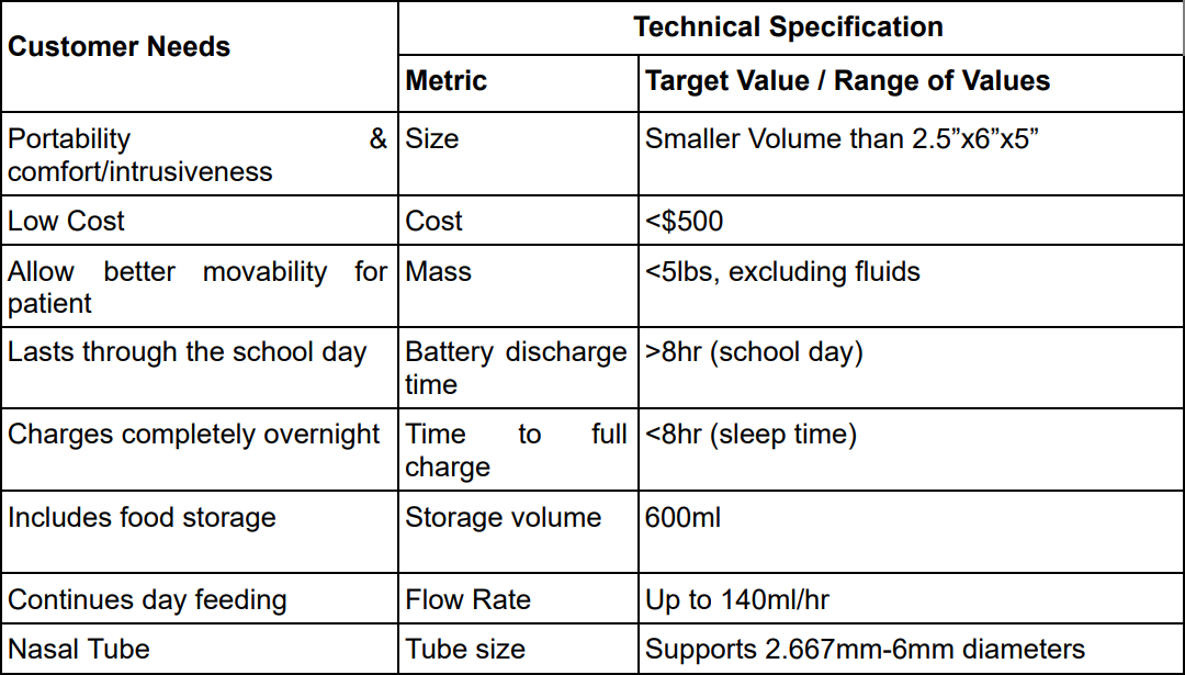
After concept selection, the team decided upon target specifications based on our user and market research.
There were many metrics to consider. The team created a prioritized list of customer needs and decided on specifications that most closely aligned with the highest priority needs.
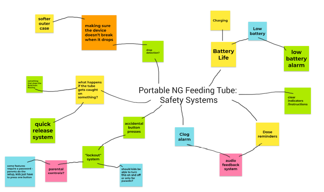
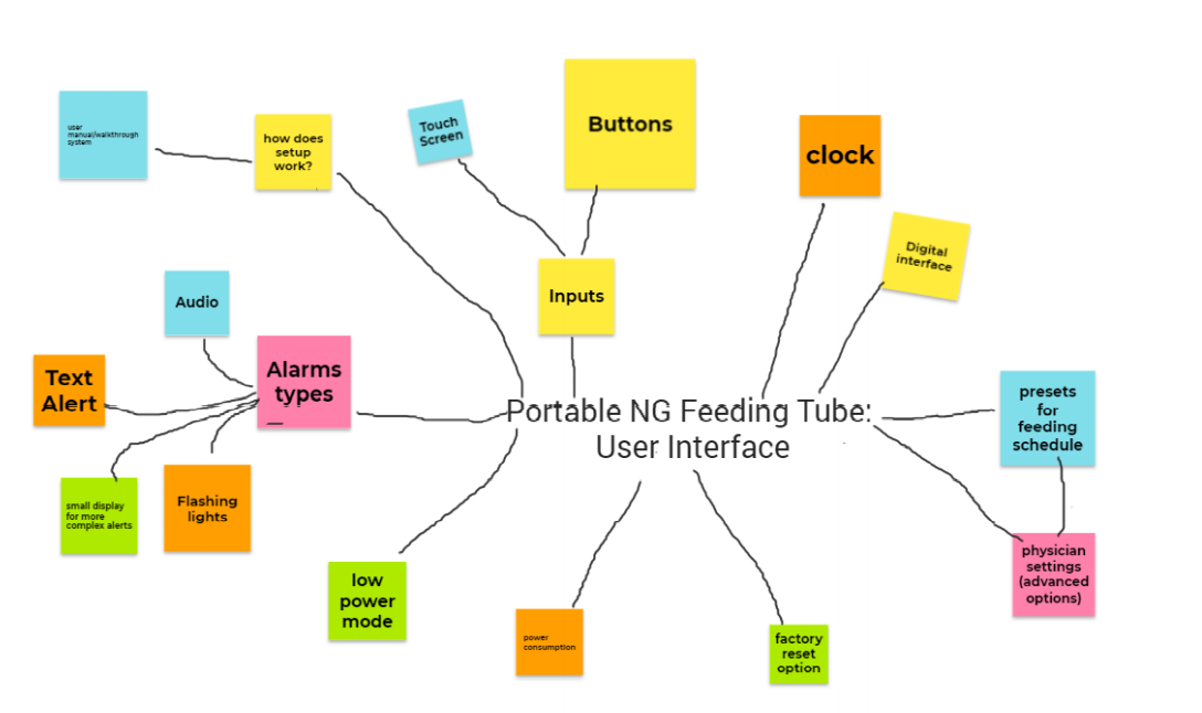
Next, the team continued to develop the concept. To do this, the team created a functional map and divided the project into subsystems based on key functions and device features. Each member then focused on a particular subsystem.
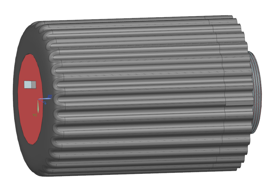
I designed and developed the cartridge subsystem. The cartridge subsystem is responsible for the fluid cartridge system, as well as its attachment to the pump device. After brainstorming and researching existing technologies, I began creating conceptual sketches. Some of the key considerations for this subsystem were cleanability, ease of use, and structural integrity.
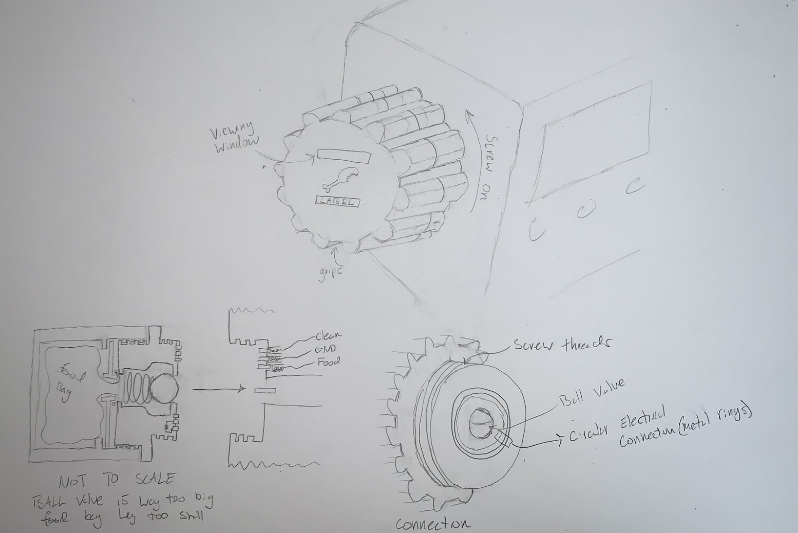
I used CAD modeling to work out the finer details of the device. After creating the first iteration, I realized that our team's fluid storage requirement was contradictory to the overall size requirement.
There was no way to store the specified amount of fluid in our specified volume. So, this prompted a series of redesigns aimed at reducing the bulk and optimizing fluid storage volume. We decided as a team to shrink the fluid storage volume rather than increase the overall size of the device.
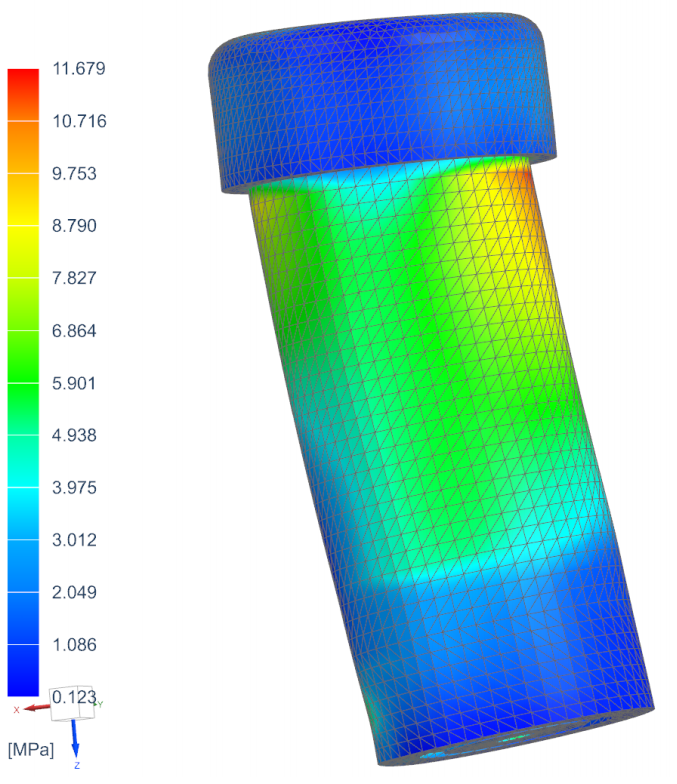
Various methods were used to validate the cartridge subsystem. To validate the structural integrity, I used Finite Element Analysis. These results were checked against an approximate analytical solution.
The image on the left shows the output of a simulated drop test from 5 feet. It shows that there is no risk of material failure, meaning the cartridge wouldn't break when dropped from this height.
Ideally, these simulations should be confirmed with an actual drop test of a 3D printed model. However, due to COVID-19 restrictions, this was not possible.
For details, calculations, and additional analysis see the full report at the bottom of this page.
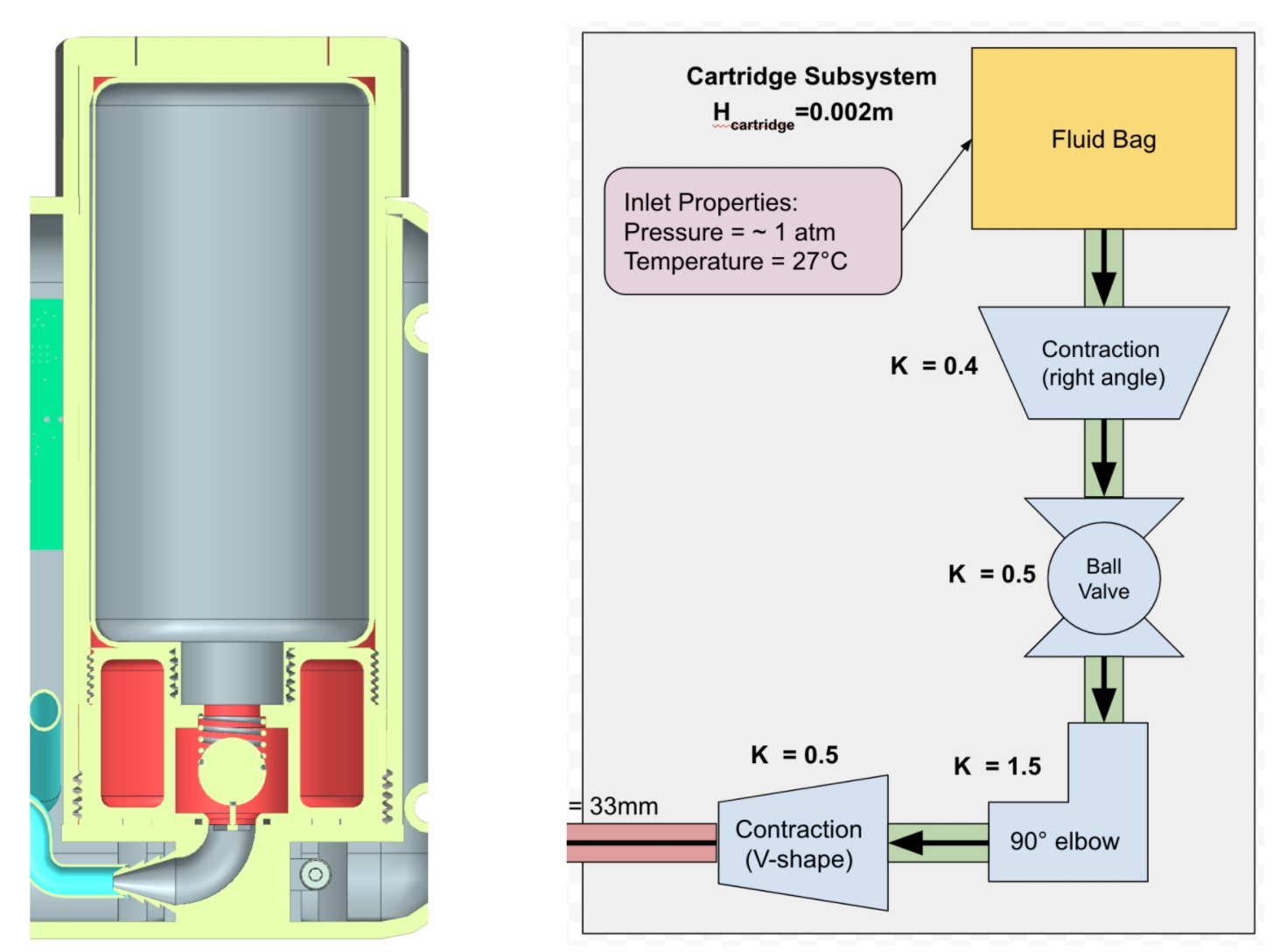
To aid in determining the required pumping power and battery capacity of the system, I also calculated the approximate head loss of the system. For details, calculations, and additional analysis see the full report at the bottom of this page.
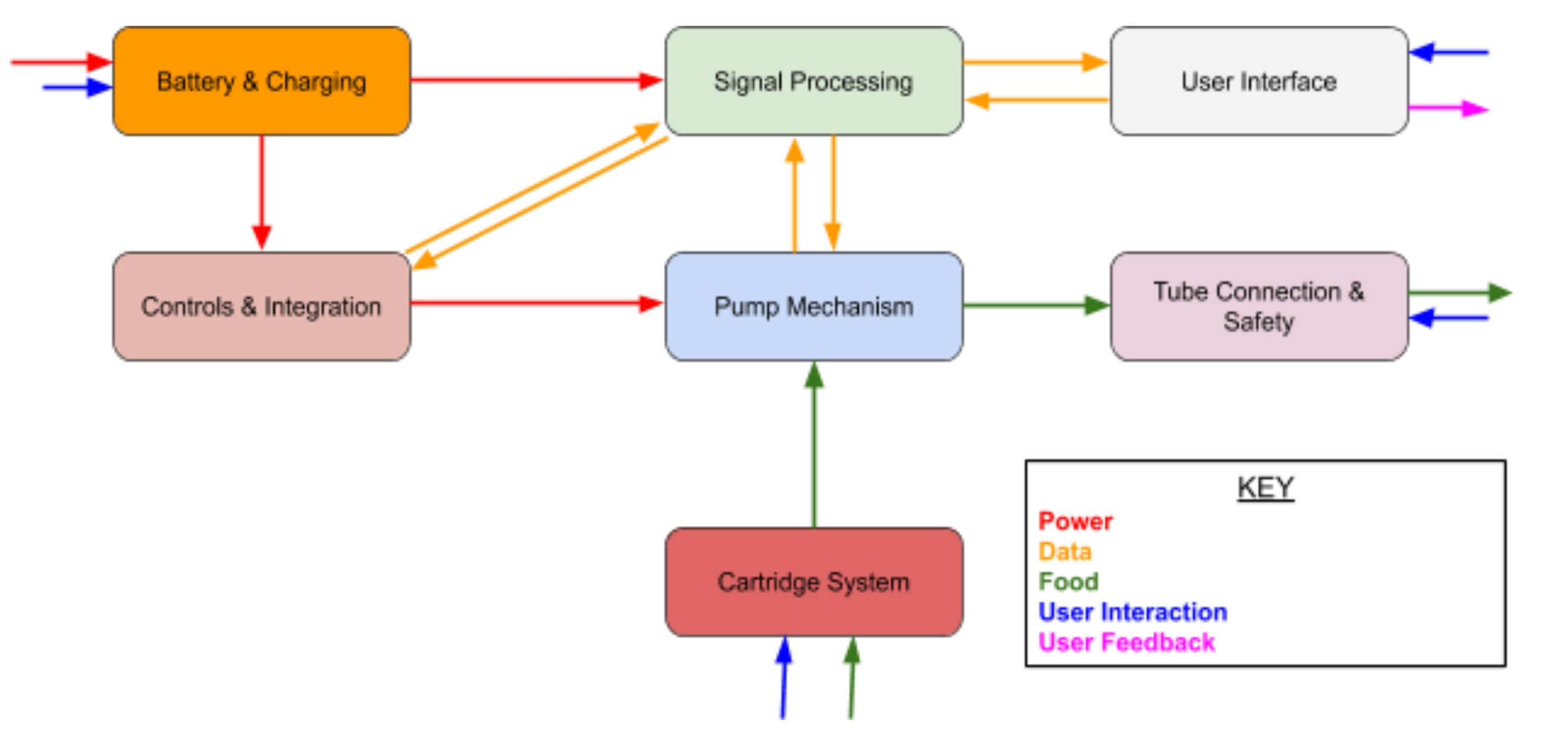
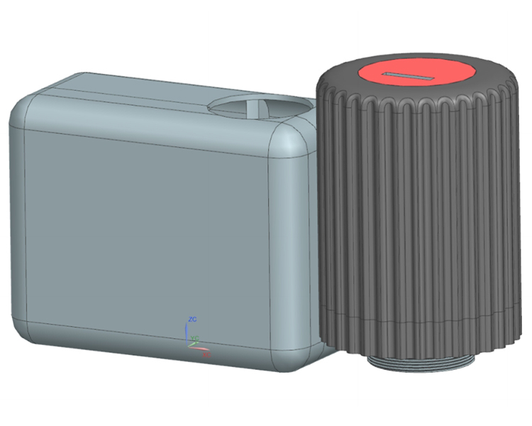
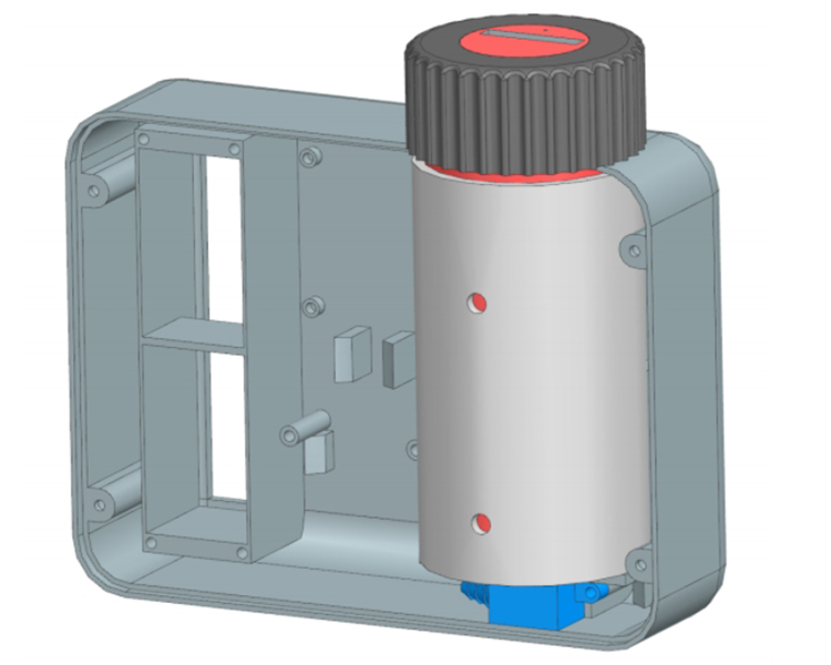
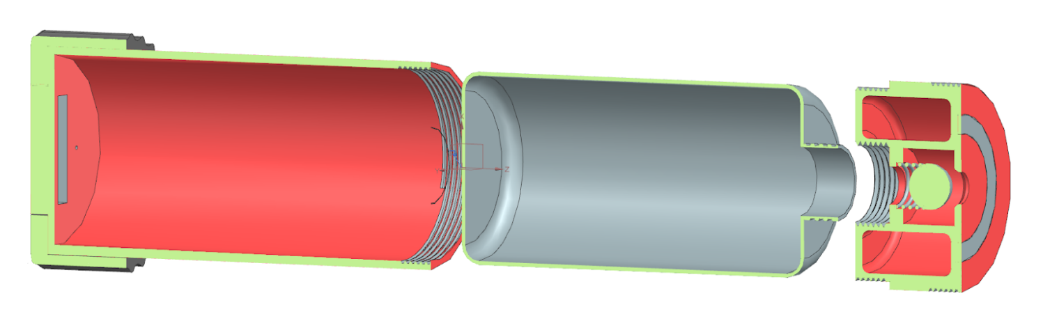
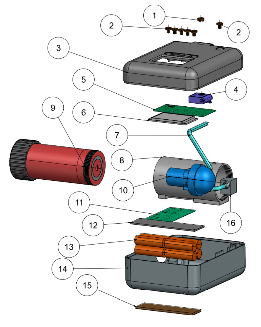
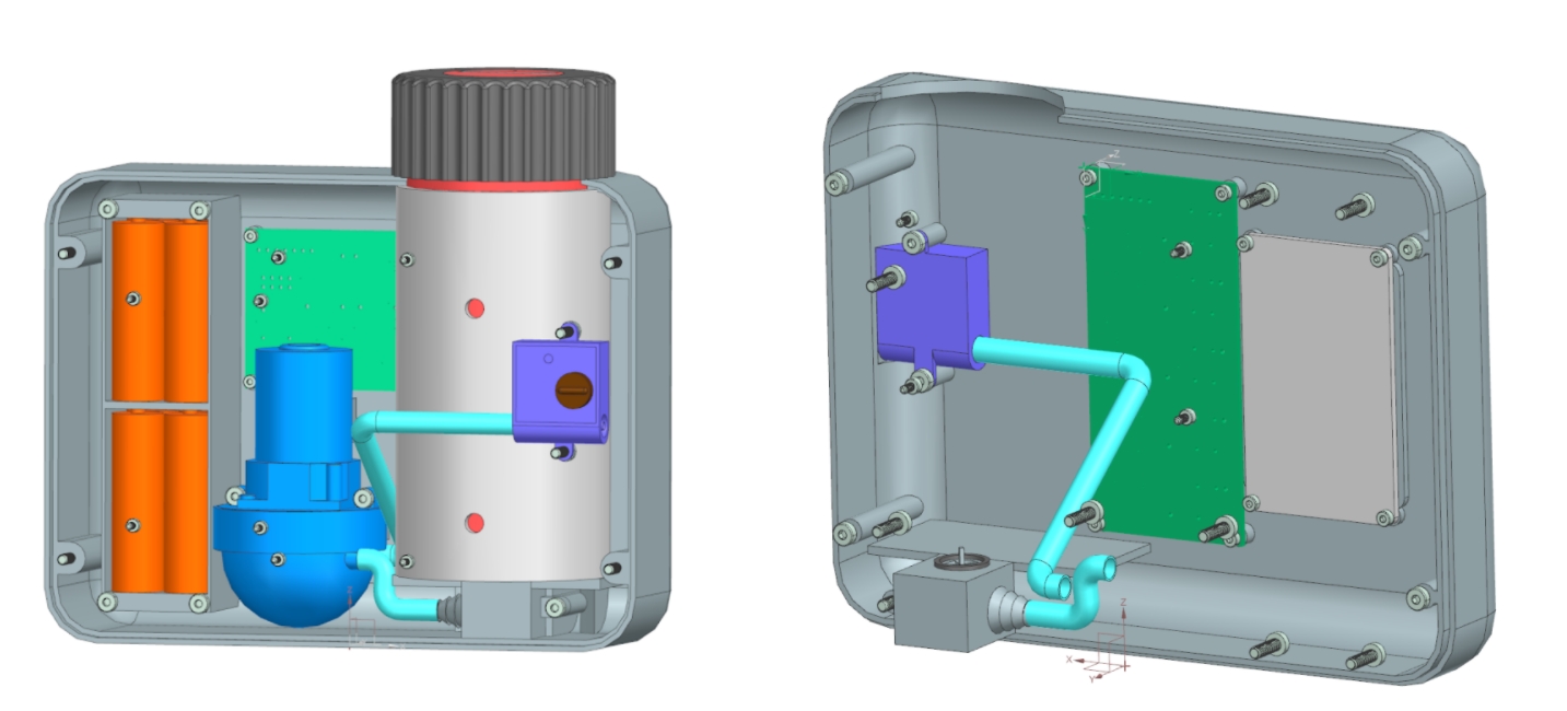
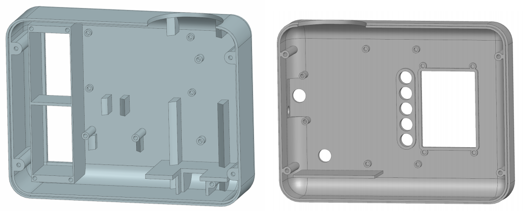
One of the last steps of the process was the integration of the various subsystems. The majority of this work was done using CAD modeling, ensuring the fit of all the components and making sure that proper mounting holes existed in the cases. I was in charge of systems integration for this project.
This model contains all mechanical components required for the pump to function as intended. The only major omission to this model is the connective wiring between the electrical components. While the wiring was omitted from the CAD model, all major electrical components (PCBs, Motor, Batteries, Screen, Buttons, etc.) are modeled and included. And, gaps between components have been left to ensure space for wires to be run should this model be built physically.
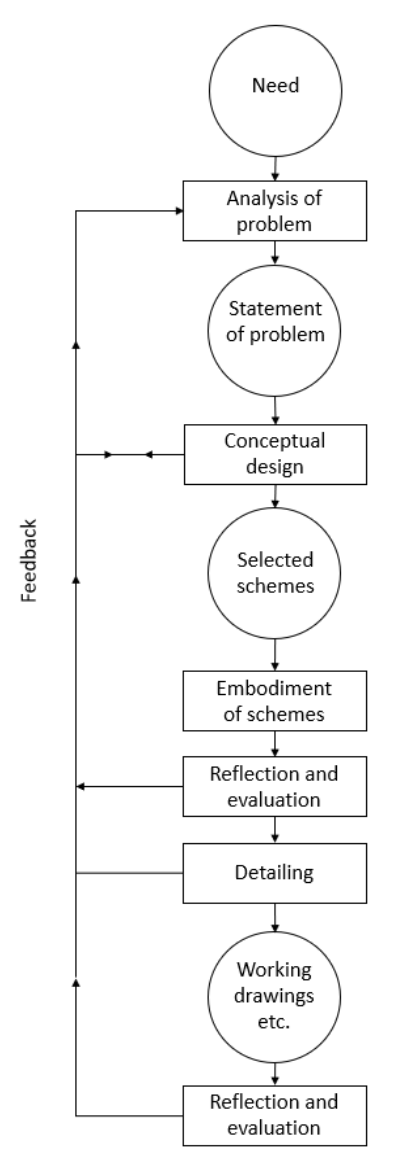
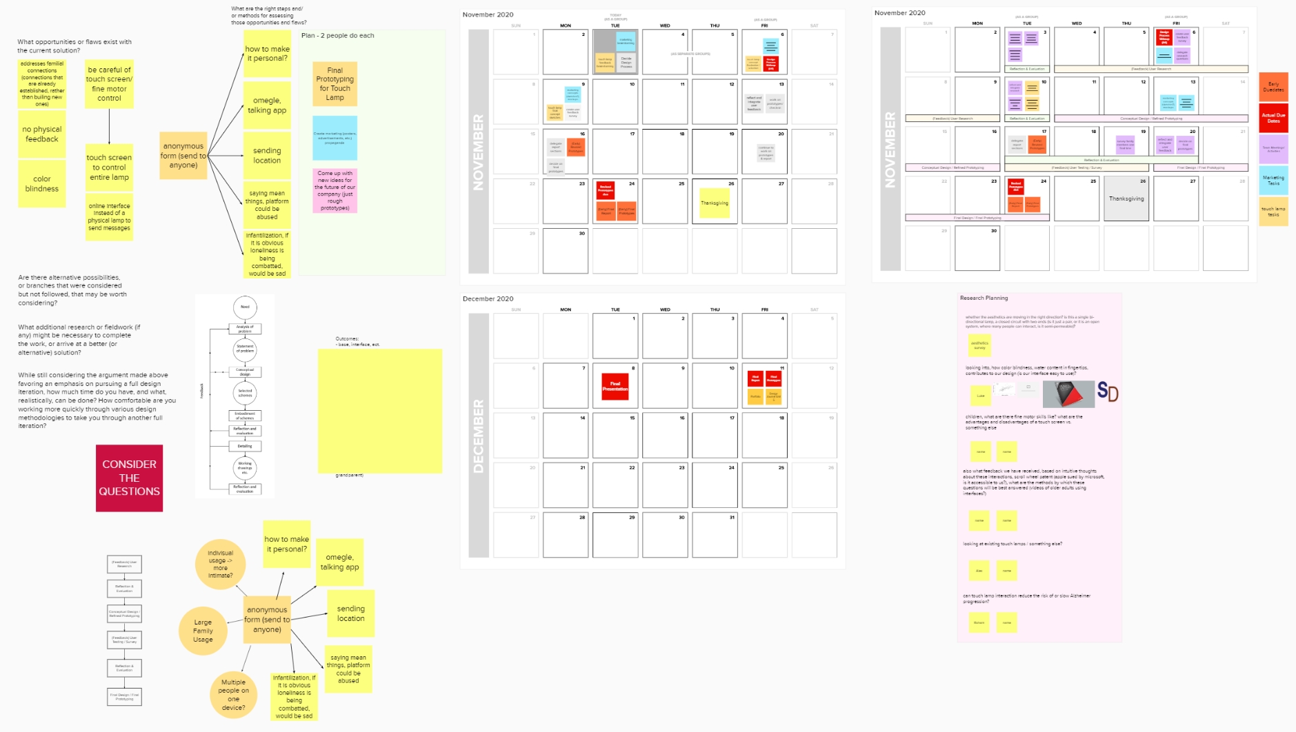
For our design process, we used the French model (shown on the right), where the circles represent stages reached, or outputs, and the rectangles represent activities or work in progress. We also took inspiration from Archer’s three-phase summary model. We decided to incorporate the creative phase of analysis, synthesis, and development into our process by having two activities of reflection and evaluation that also connect back into feedback, so that we can improve our design work.
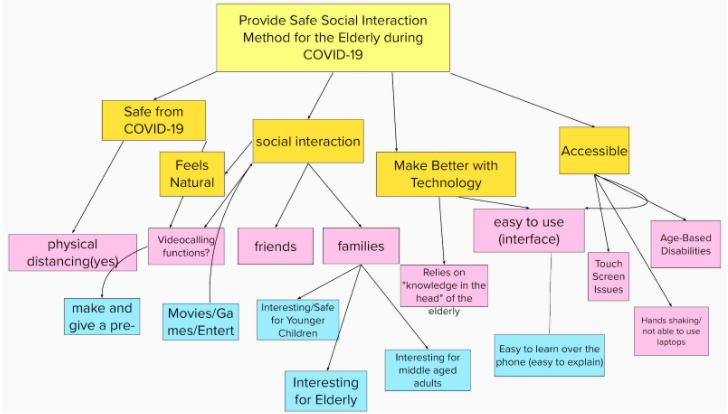
The most important part of this project was background research. It was vital to the success of this project that we understood our target user group. Without knowing their likes, dislikes, and day-to-day activities we would be unable to design a product that could integrate into their lifestyles.
Our research draws from academic sources, popular sources, and first-hand interviews with members of the target demographic. If you are interested, a summary of the group's research can be found in the "background" section of the report liked at the bottom of this page.
We aimed to design something that allows our target users to easily and effortlessly have meaningful social interactions with their younger relatives while staying physically distant. So, secondarily, we are also designing for the families of these older adults who will likely be users of our final design. Because of this, we must make sure that our design is “child”-friendly, and works for those on both sides of the social interaction.
How can we create a meaningful yet effortless method of communication between older adults and their younger relatives that facilitates meaningful social connection and encourages phone conversation? How can we accomplish this with a physical product that doesn’t require technological expertise? How can we ensure our product encourages, not replaces, further interaction through phone conversation?
After solidifying a problem space and problem statement, the team moved onto concept design. In this phase, we generated broad problem solutions in the form of schemes utilizing by analyzing stakeholders, creating an objective tree, and organizing and brainstorming with a mind map. The team initially selected the "Wizard's Chess" idea since we felt it most adequately responded to our user's needs.
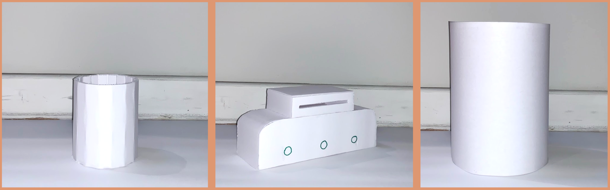
To gain initial user feedback, the team constructed low fidelity foam core prototypes of our most promising ideas and used them as a part of a hands-on survey of older adults.
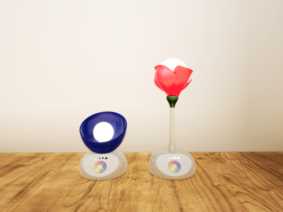
After carefully evaluating the preliminary survey, the team unanimously believed the touch lamp idea offers the greatest potential. The users claimed it was a good method to increase connection and interaction with family members. They were able to visualize themselves interacting with it as if it were a normal lamp, but also a form of casual communication.
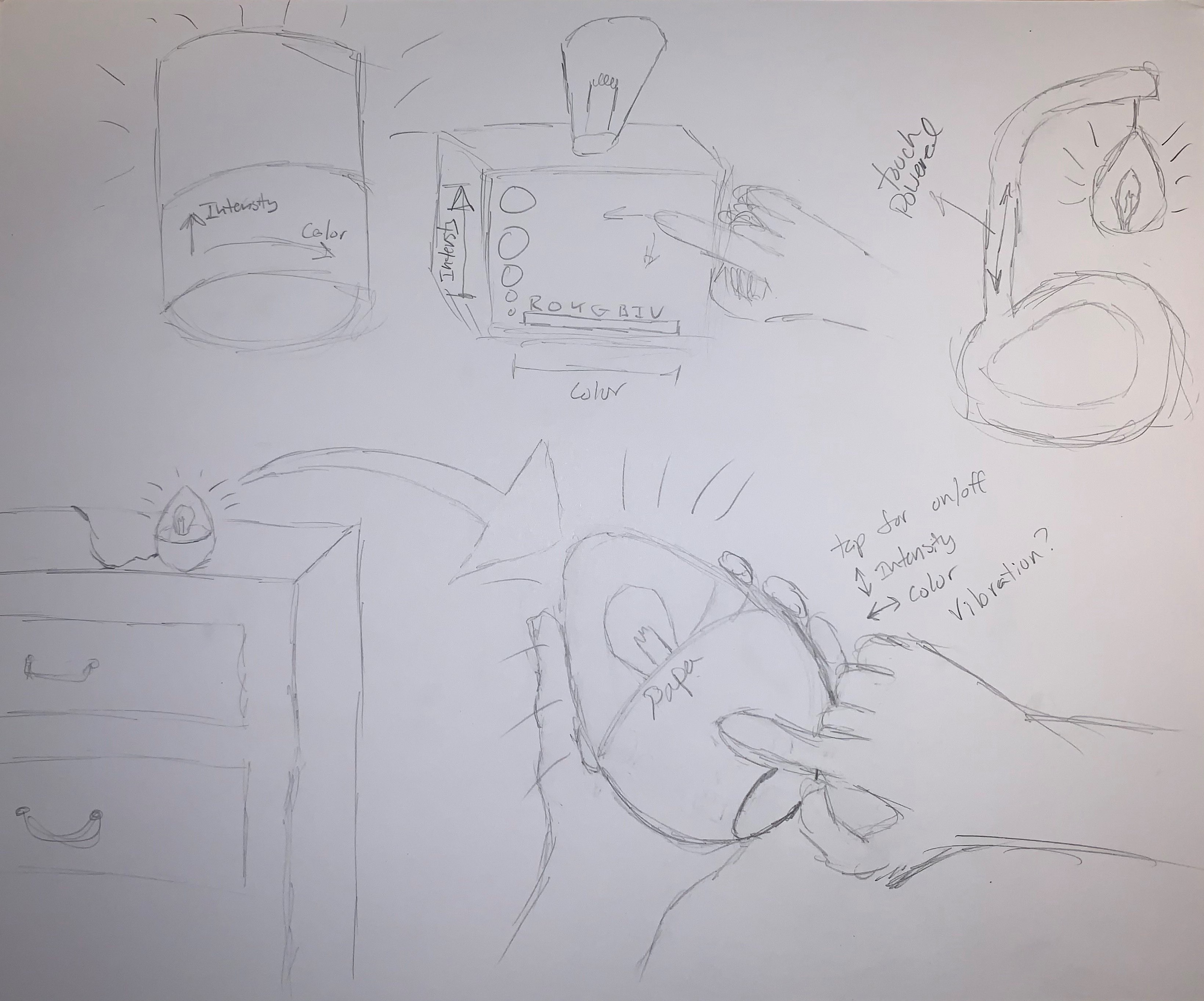
After selecting the touch lamp idea, the team continued to refine the concept with additional sketching and brainstorming.
The team utilized Mural, a virtual whiteboarding tool, as a way to work collaboratively in a virtual environment. This allowed us to organize our thoughts and ideas in a communal space as we continued to develop our concepts.
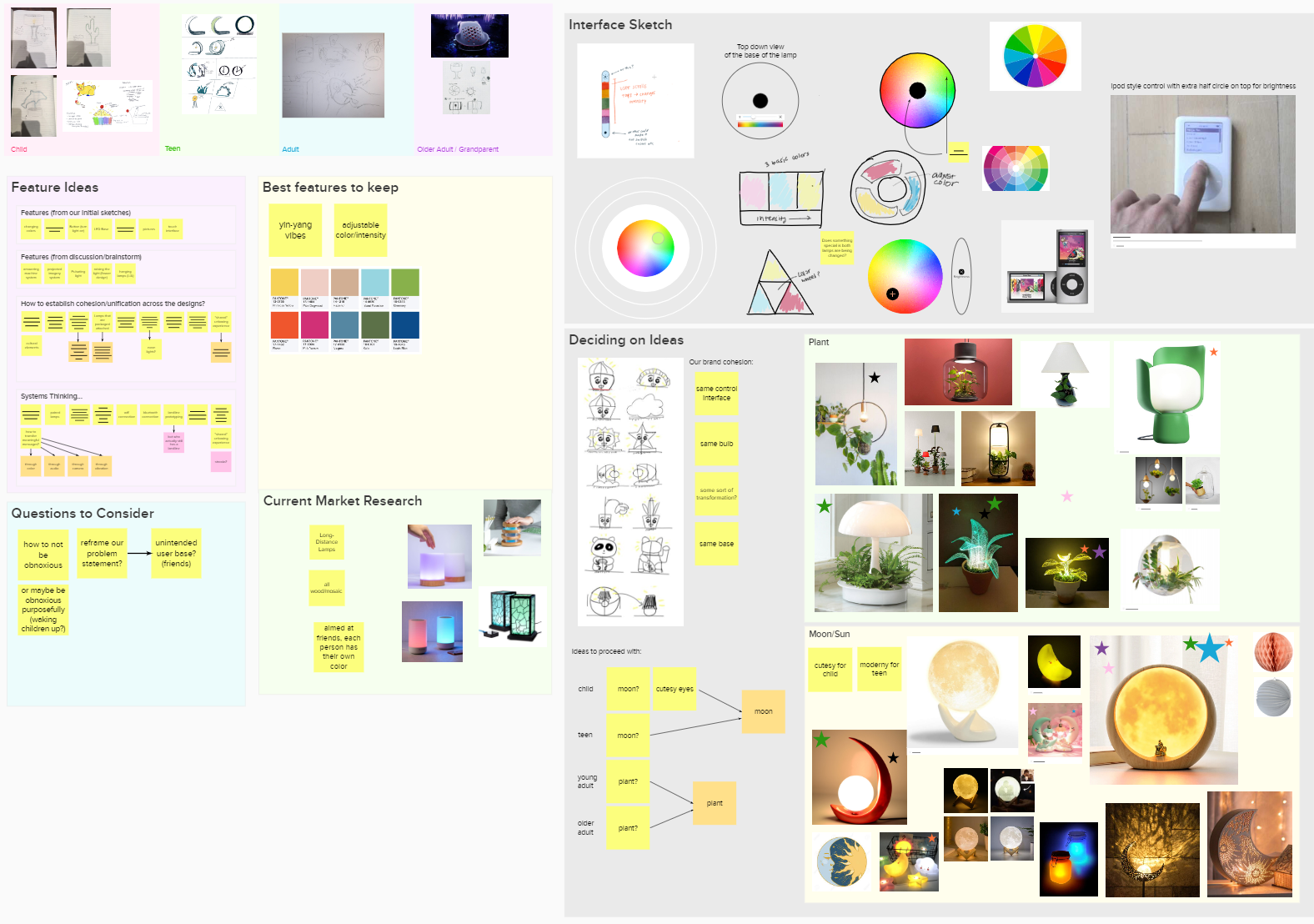
At this stage, the team was designed with four major user groups in mind: Children, Teens, Adults, and Older Adults.
As the project progressed, we continued to use mural as a way to lay out our thoughts and work collaboratively. We also used it to create a timeline for the last few weeks of the project.
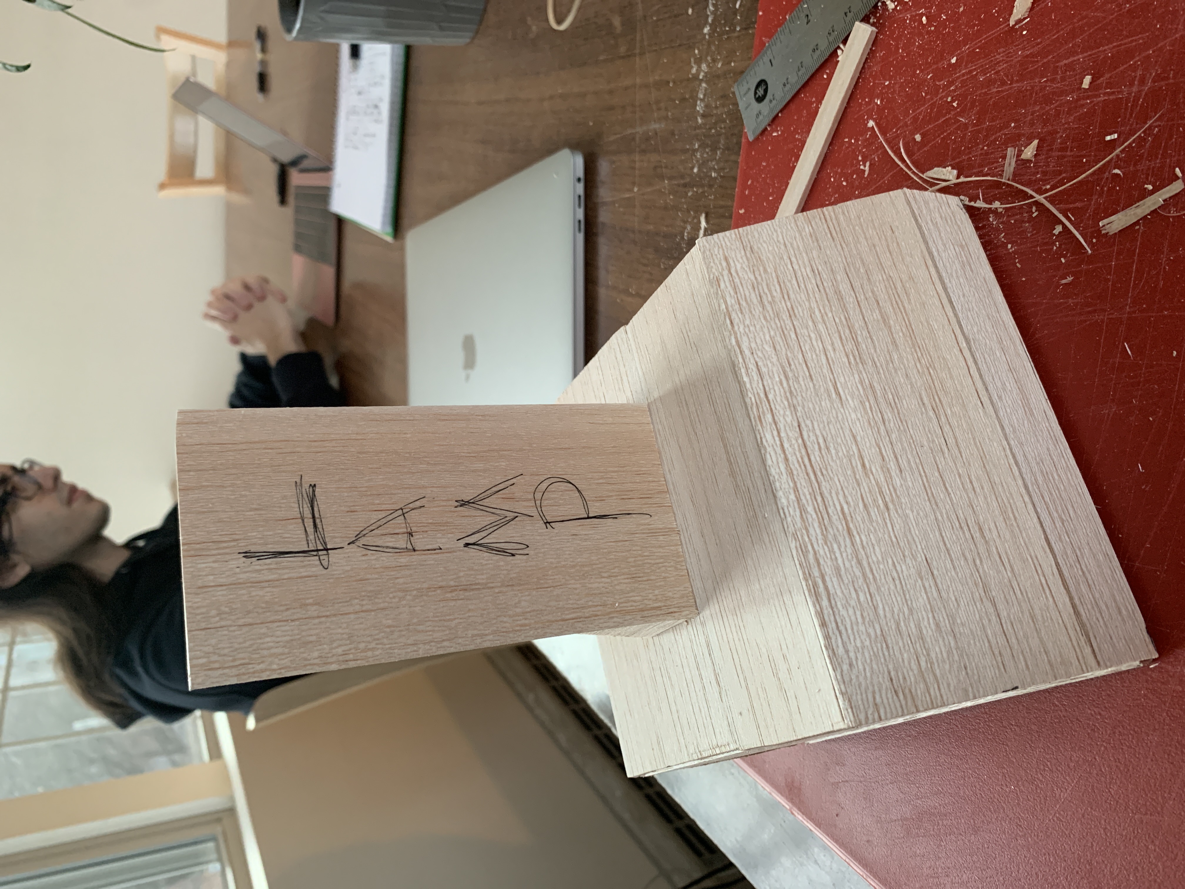
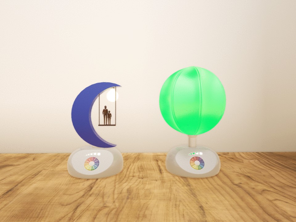
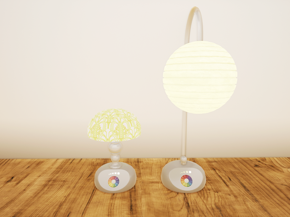
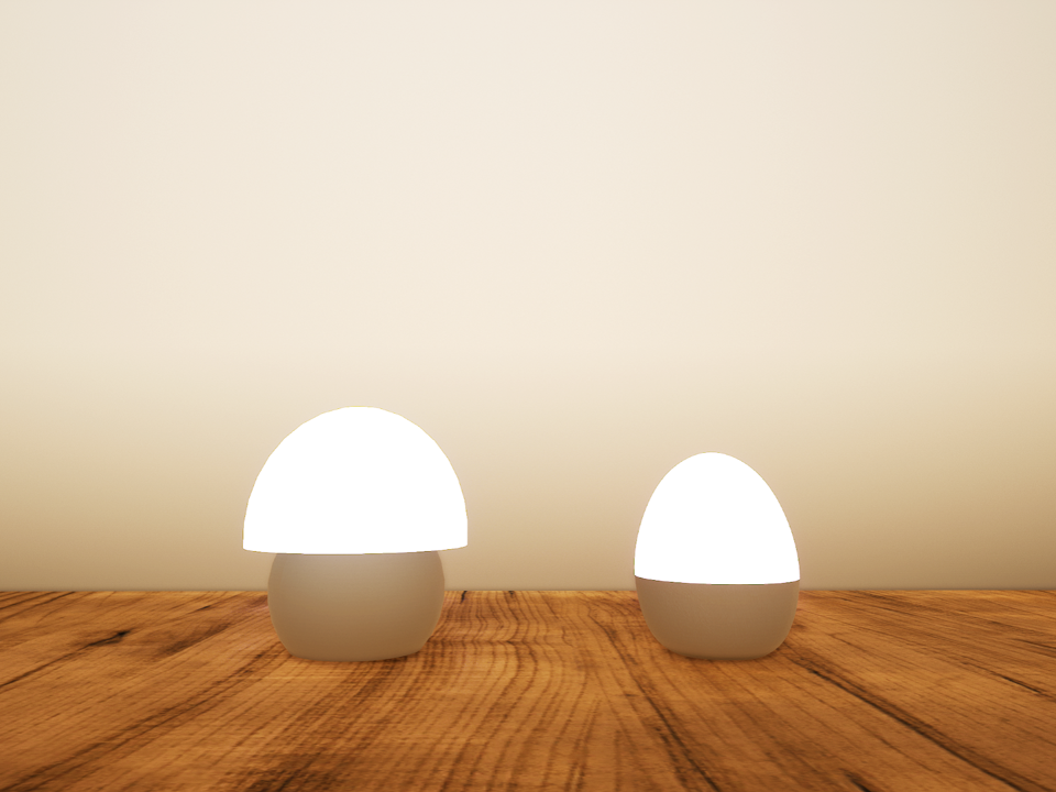
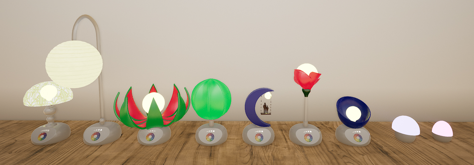
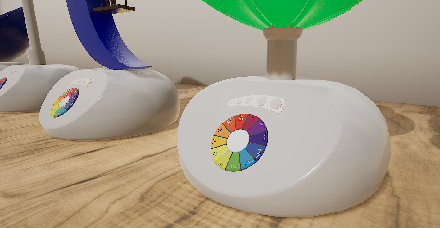
After the team had a solid idea of the product we were creating, we focused on the finer details of the product. We spent considerable time focusing on uniformity across our various lamp designs. We wanted them to feel connected, and so focused on creating a unified base and interface design.
On the left is an early wood prototype of a base design. This was used to gather user feedback on the optimal interface angle.
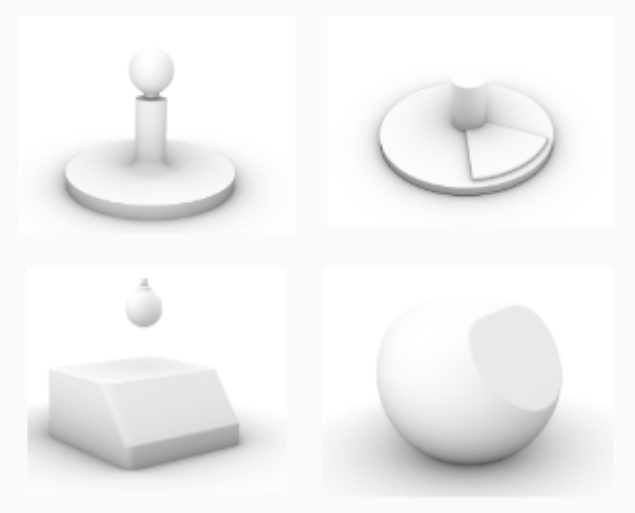
Various different base shapes were considered and rendered before making a final decision.
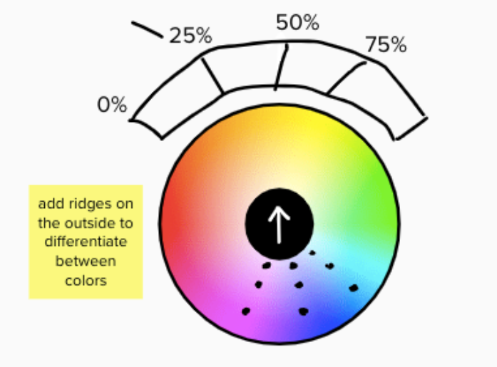
In the design of our interface, we paid special attention to accessibility. We made sure that the interaction method (touch screen) was older-adult friendly, and that tactile feedback was included for those with poor vision.
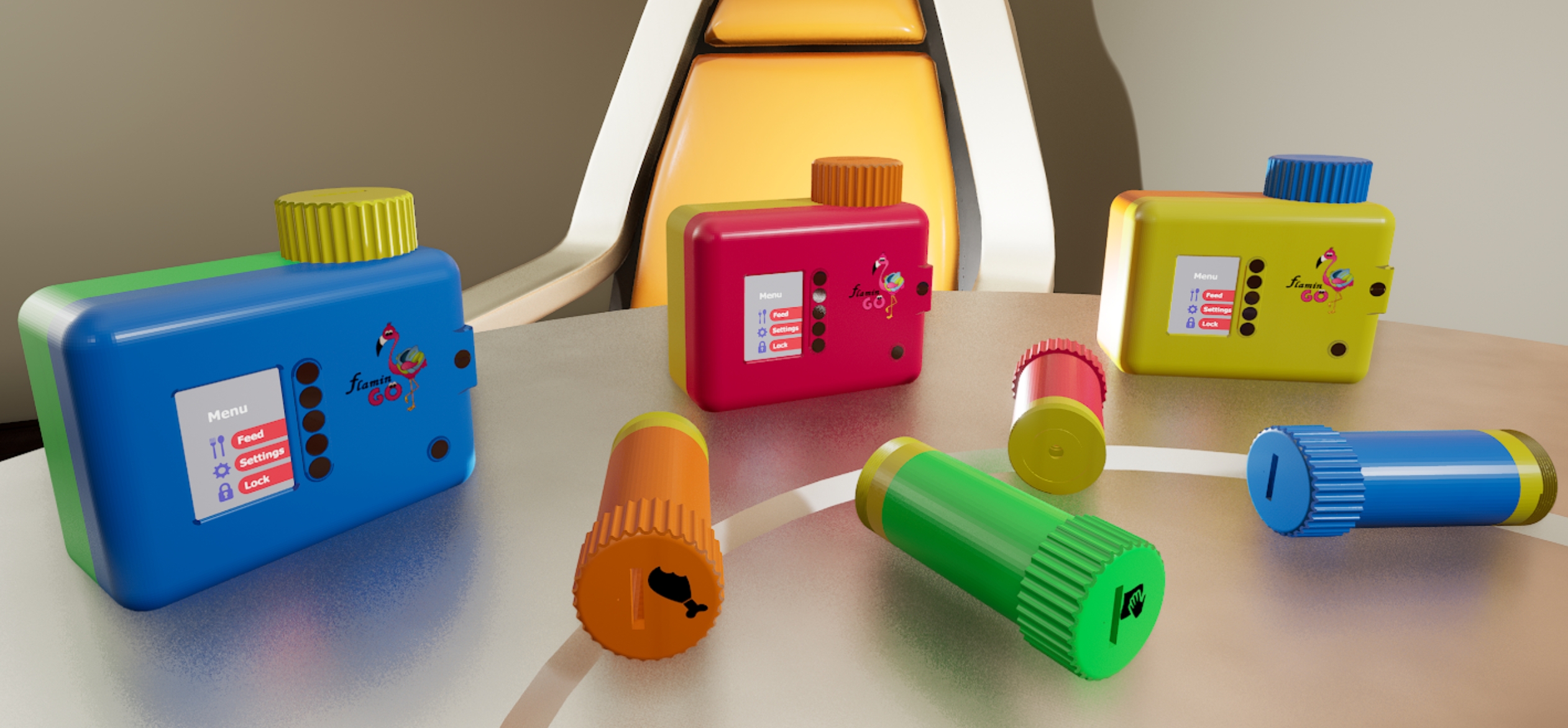
After finalization, the team modeled the final lamp designs in Rhino and rendered them using Unreal Engine.
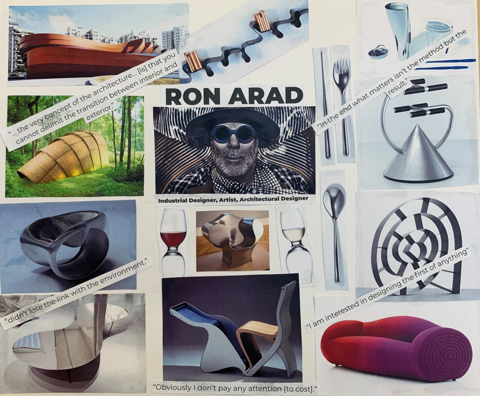
We started out by researching our designer, Ron Arad. Ron Arad is an Israeli designer and architect who is always looking to design the first of anything. He loves exposed, shiny, silver metal. He works with curves in a unique way, trying to make each object appear as if it has a single, interesting, continuous flow. He uses bold block sections of, often primary, colors. These were some of the key stylistic and characteristic takeaways we made sure to keep in mind while brainstorming our design project.
To aid in our designs, we created a mood board of Ron Arad's work.
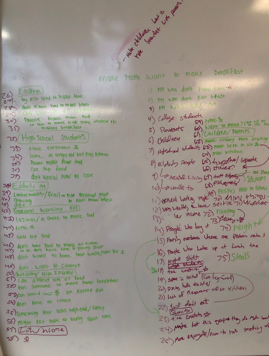
Through mind mapping, we narrowed down our problem space to a few key issues children have in the kitchen and generated potential design solutions. We soon realized that in many cases our designs were for the parents, not the children. So, we decided to reframe and refine our problem statement to, “How can we make cooking more accessible, clean, and fun so that children and their parents want to make breakfast together?”
We decided against our floor mat and counter mat ideas because kitchens are commonly designed to have easily cleanable floors and counters. After eliminating a few other designs, we were left with three ideas; an egg cracker where you smash the egg, an interestingly shaped stool, and a mixing bowl that contains splashes while letting kids have fun with mixing.
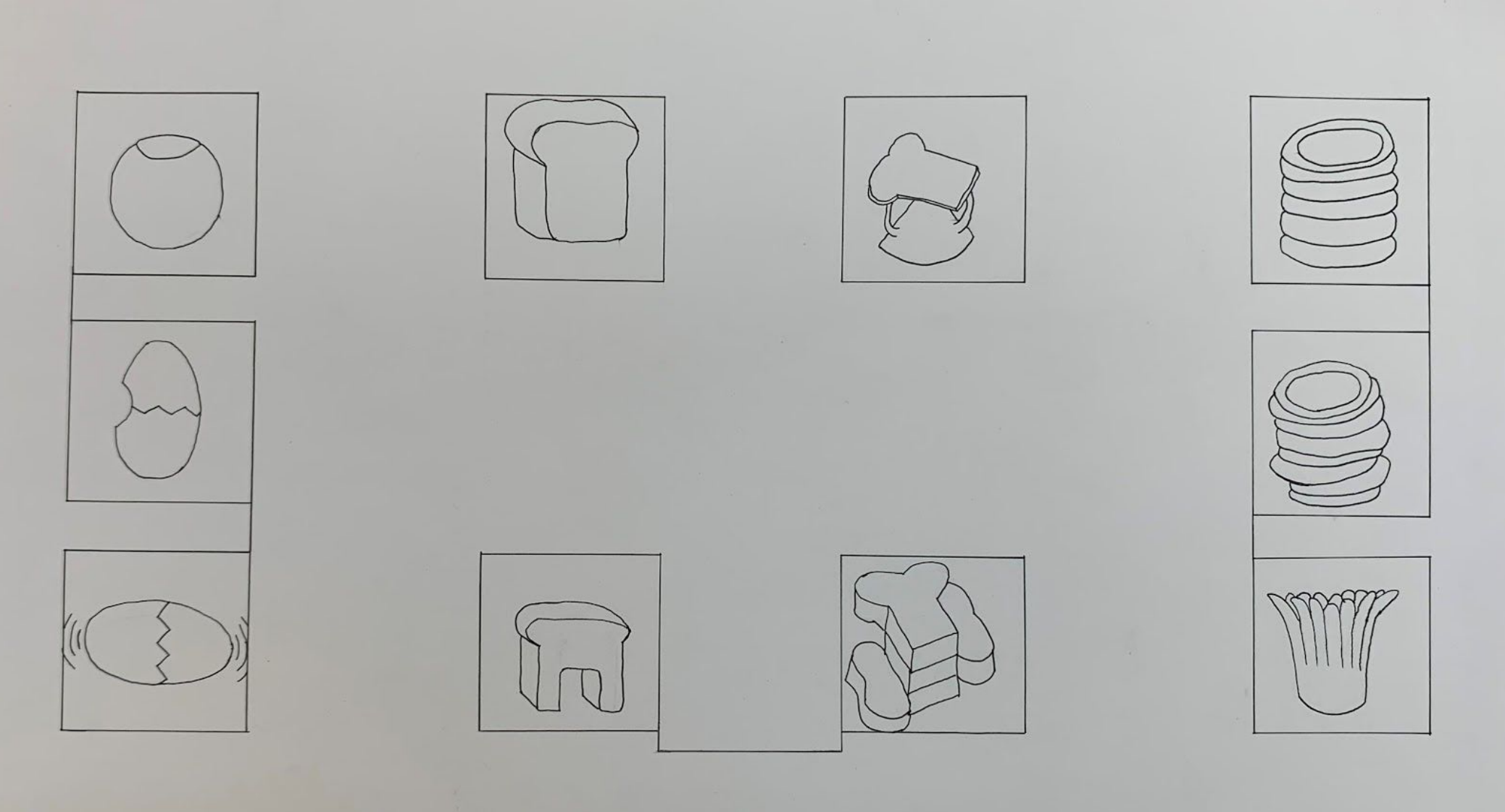
We spent a long time working on the egg smasher idea but eventually scrapped it because we couldn’t find a way to keep the shell from mixing with the egg. However, from our discussion of the egg smasher, we realized that a small receptacle for the shells on the counter would keep things clean by giving children an easily accessible place to put food waste. This led to the egg smasher being replaced by a compost bin in our series.
We received feedback that the bread stool looked like two independent pieces instead of one object. We wanted to address this in the prototype, as it goes against one of Ron Arad’s core aesthetics.
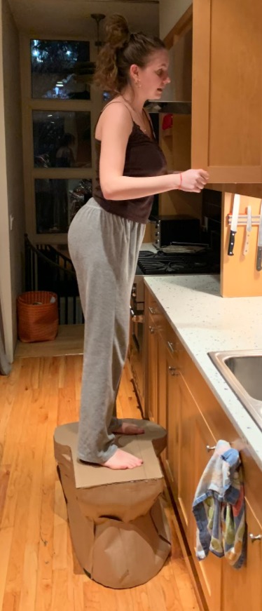
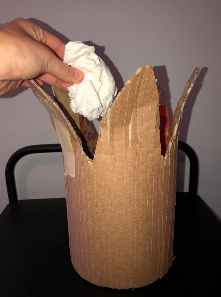
We made the bread stool out of cardboard, full scale to test the form and function. We made more of a smooth transition from the circular base to the bread loaf top to make it feel like one continuous object. During limited user testing, we received feedback that it didn’t feel like you were teetering on the edge, which was one of our concerns.
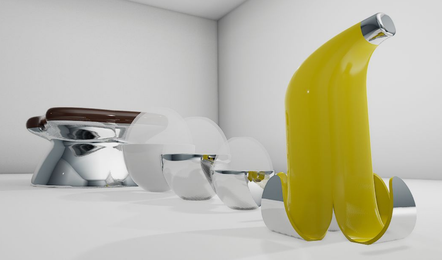
We made the compost bin from cardboard to test the form and sizing of the object. While testing was limited, it was successfully used to determine the size we wanted. We also pivoted slightly during prototyping, changing the food from strips of bacon to a banana peel with fewer breaks and more curves.
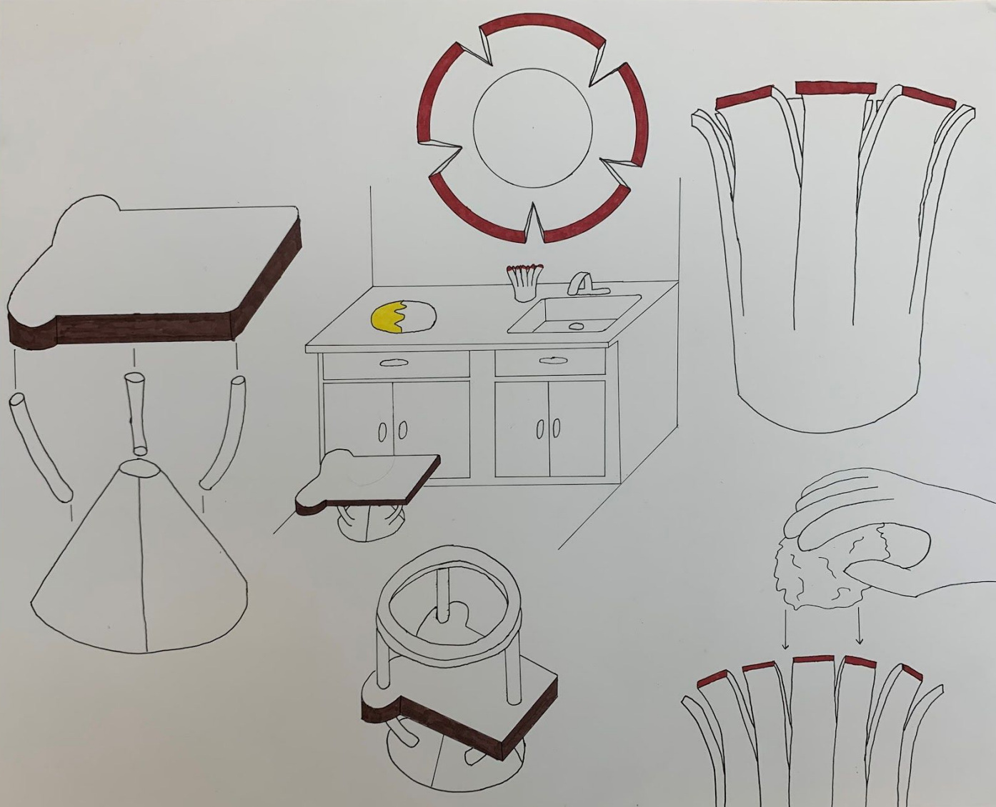
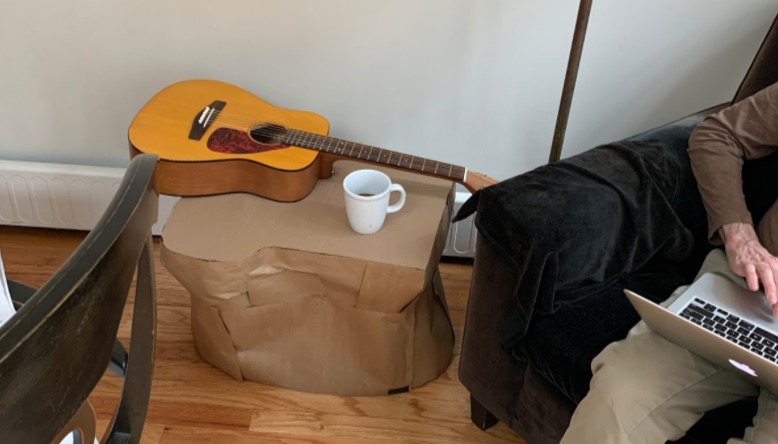
Through accidental user testing, we discovered the bread stool is usable as an end table.
Taking into account user feedback, we made iterative changes and modeled our final designs. We also received feedback from other studio groups, which informed many of the changes in the final iteration.
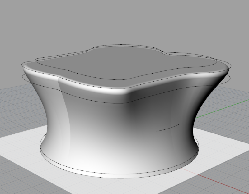
People responded positively to the new form of the stool and suggested the addition of handles, steps, and making it collapse for storage. In response, we added a hand hole that flows with the curve and cuts entirely through the object. This creates handles without breaking the flow and is reminiscent of some of Ron Arad’s chair designs.
We chose not to include steps because we didn’t think they were necessary and they would disrupt the form. Similarly, we didn’t make the stool collapsible because it is intended to function as a sculpture when not in use like many of Ron Arad’s designs.
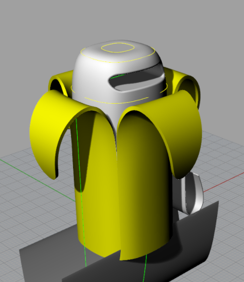
While feedback on the compost bin was mostly positive, many pointed out the need for a lid. We agreed and included a lid, with a similar handle to the bread stool in the next prototype. We also tried inverting the direction of the peel.
We received feedback that most people, like us, preferred the inverted peel design but the lid seemed wrong. Our Professor noted that it looked wrong because we should be seeing the unpeeled banana as the lid, so we designed a new lid for the final prototype that flows seamlessly into the body of the banana when connected.
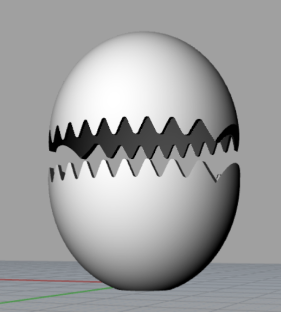
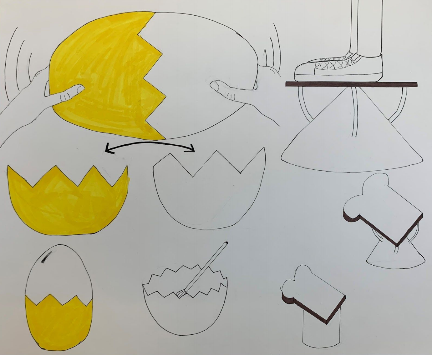
We received feedback that the egg bowls “teeth” were too sharp, as well as feedback that the locking mechanism wasn’t clearly visible. We responded in future iterations by dulling the teeth and removing them entirely from one side. This allows the locking mechanism to work better, by the toothed half sliding into the other side, and gives the appearance of the egg “breaking” when the two halves are split apart.
We also made the top half transparent to let users see what is going on inside. In our final iteration, we also changed the accent color from yellow to white to separate it from the compost bin.
After making final CAD drawings, we moved into Unreal Engine where we created final renderings of our designs.
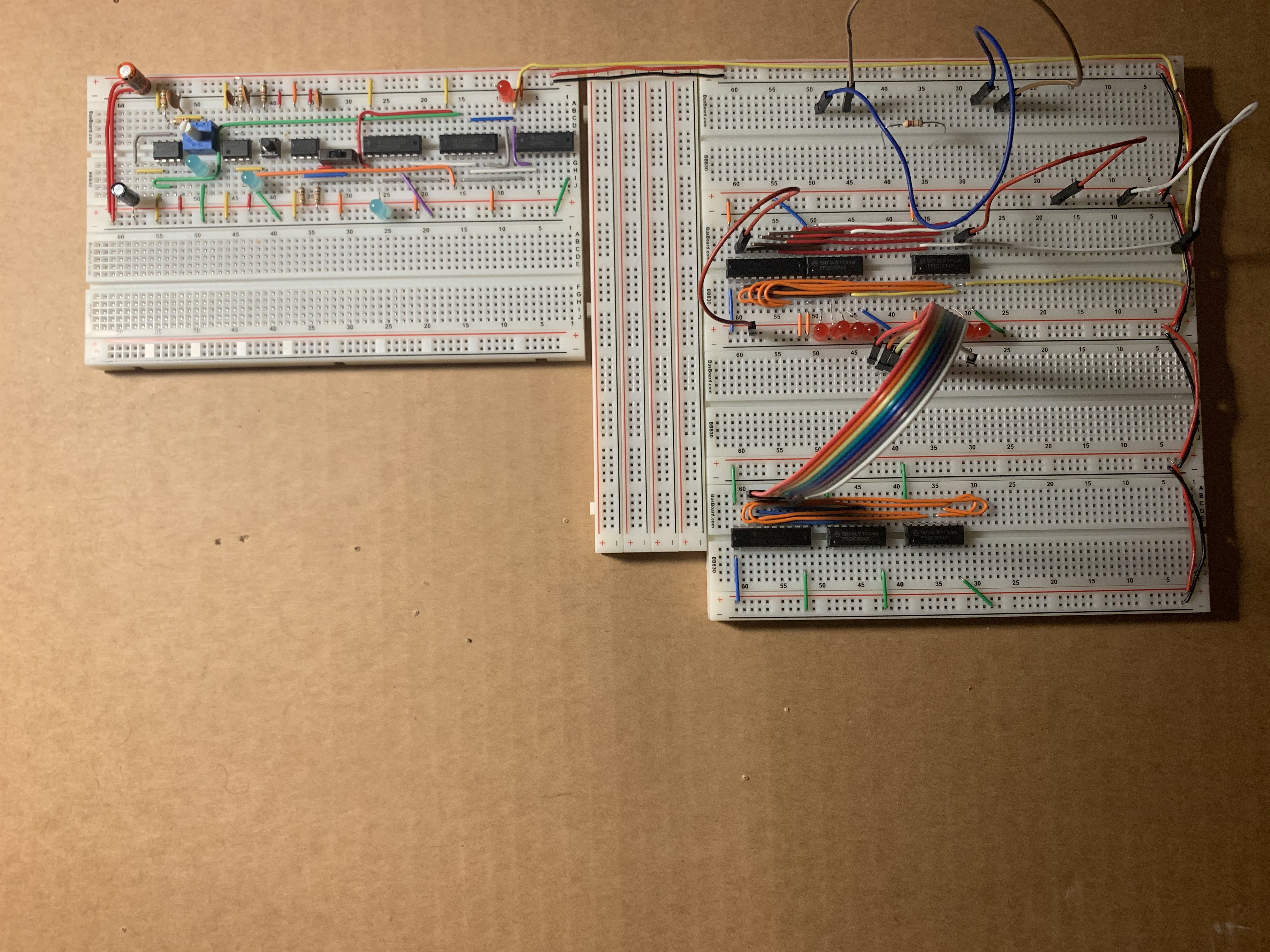
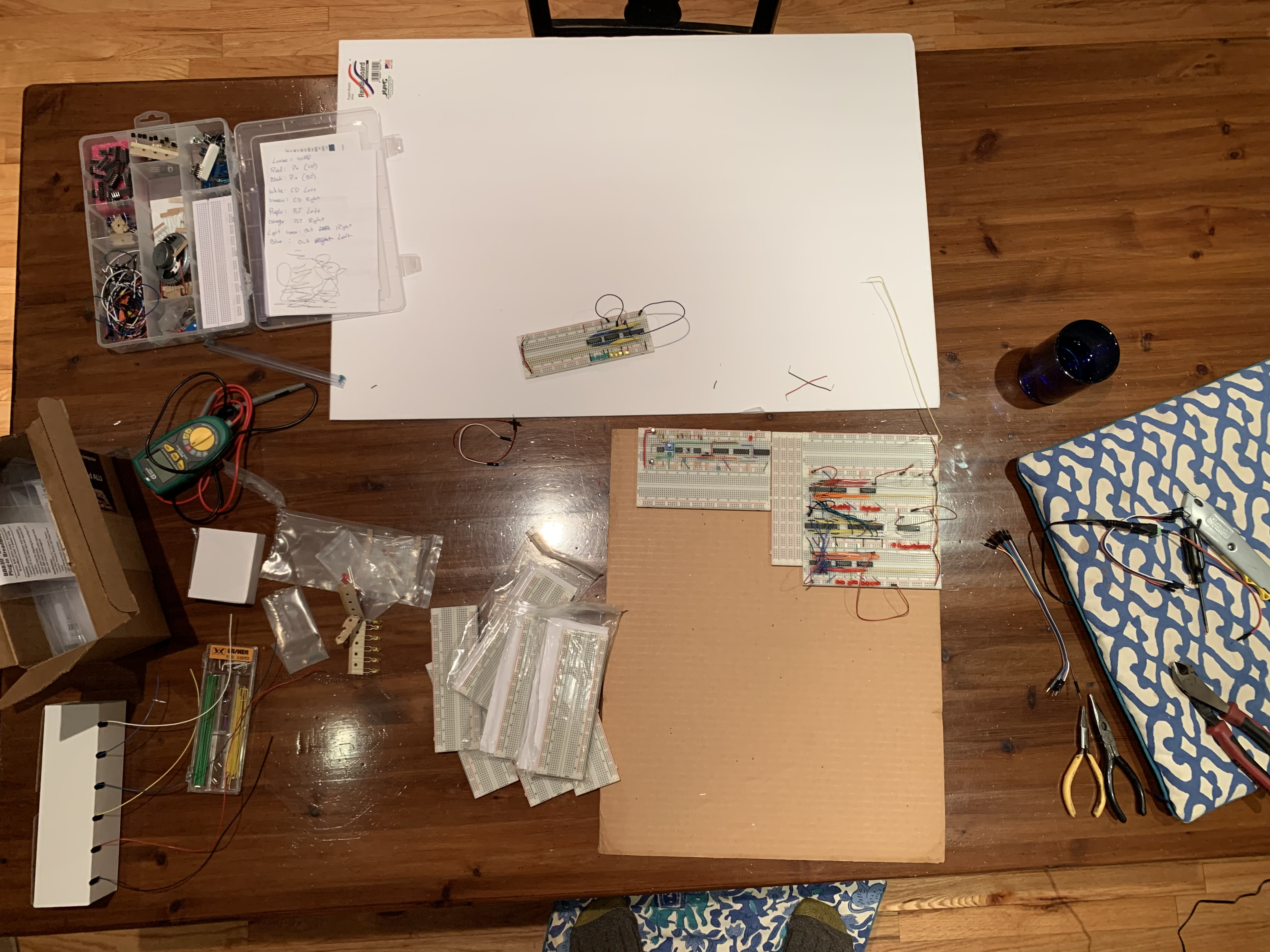
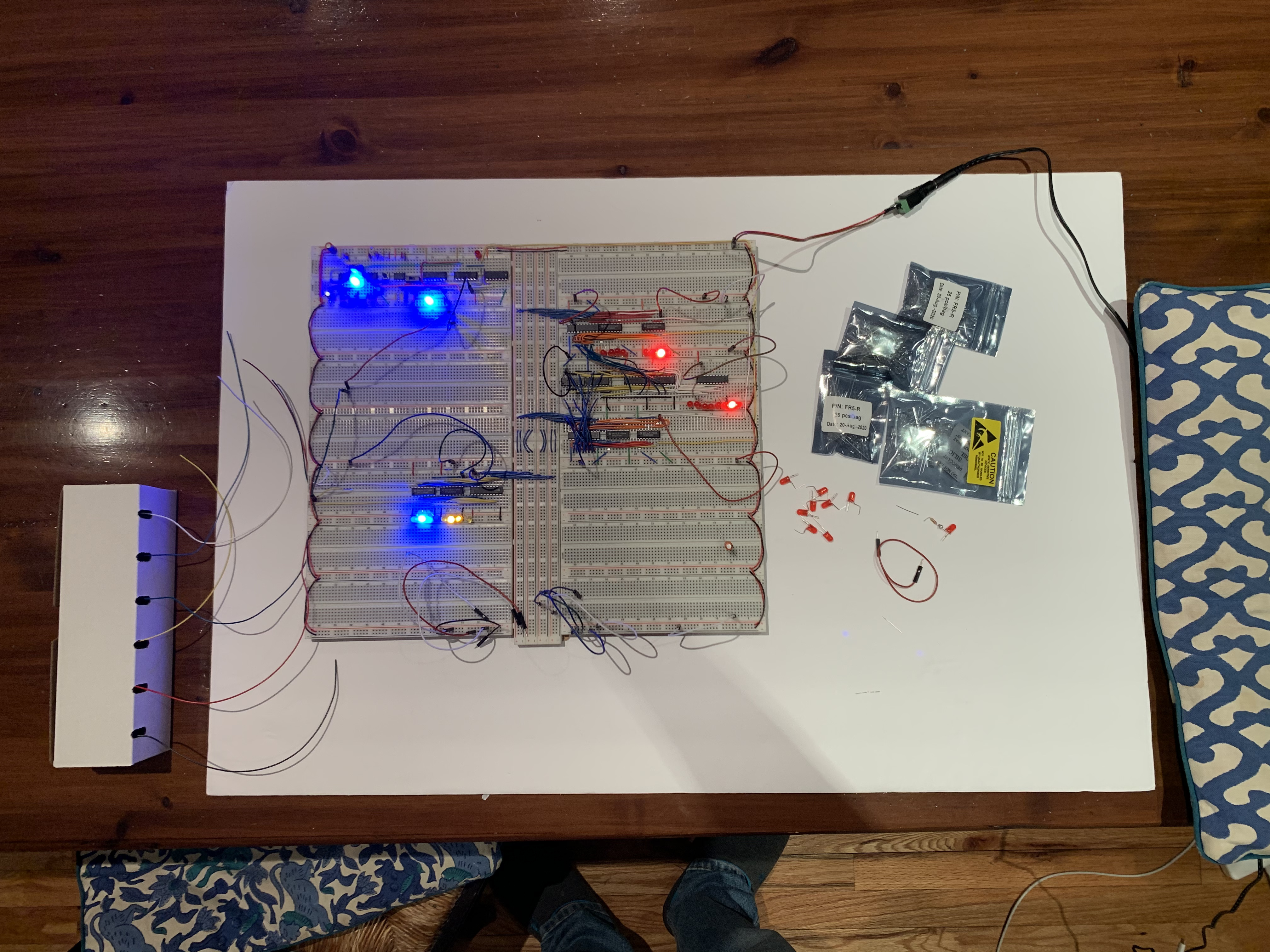
So far I have built the clock system, registers (A, B, and Instruction), and ALU (Arithmetic Logic Unit). I am following Ben Eater's 8-bit computer schematics, making modifications here and there.
At the core of the clock module are three 555 times. One is in Astable mode to produce the clock, the others debounce the manual clock pulse button and switch. For the registries I used 74LS173 chips for storage and an Octal Bus Transceiver to control output to the bus.